Thursday, October 29, 2009

Whitstable fish market figure: lino print


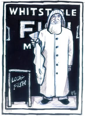
One of the first pulls, (hand-pressed). A good result, but I’ll be tweaking it here and there of course. Some of the lettering needs tightening up, for instance. Water-based block printing ink on brown wrapping paper.

Whitstable fish market figure


Finally the block is inked up with water-based block printing ink (I’ll use oil-based ink for once I am happy with the final block as it won’t smudge with hand-colouring by watercolour paints).

The final cuts in the base of the figure. Just the blackboard left at this stage and getting rid of the extra lino outside the border.

Monday, October 26, 2009

Peter Gander on the Isle of Wight’s VentnorBlog


The postcard I painted specially for Vintage Vacations was recently featured (with permission) to illustrate an article about building renovations on VentnorBlog.com

Nearly there...


The fisherman is now mostly cut away, leaving just the outlines and buttons to print black. Not far to go now. Fingers aching from tensing.

Thursday, October 22, 2009

Work-in-progress, Whitstable fisherman figure


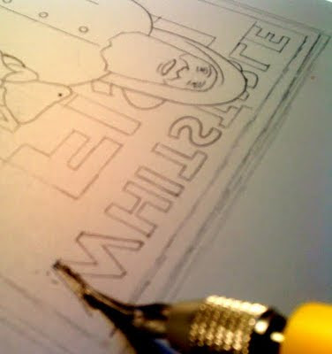
Following the previous black and white design, I re-drew it all on tracing paper, paying particular attention to the distinctive font found on the fish market’s outer wall, which is painted on the shiplap/weatherboard-style building.
The fisherman obscures much of this font anyway,so I used trace again to check which letters would realistically be visible behind him. Pencil outlines normally suffice with a simple linocut, but to ensure accuracy especialy with the font here, I went over the whole thing with a fine pen. It also helps to see the design here ;) ‘The first cut is the scariest‘ as Rod Stewart nearly said. All went well on my nicely-warmed lino. The final sans serif font cut completed.

Tuesday, October 20, 2009

Design for Whitstable fish market fisherman


Not sure if I will actually go to the lengths (and extra lino plate) to add the shading shown here, unless I hand-colour, but am happy with the composition. You can see the blue Biro construction lines in places where I ghosted the proportions first. The white lettering style is very distinctive and very peculiar to Whitstable and especially to the black, shiplap-clad fish market.

Whitstable fish market fisherman


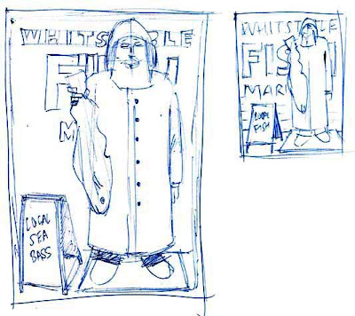
Returning to the theme of this fine fisherman outside Whitstable’s Fish Market (see previous post), I thought he would make a great subject matter for a linocut. The above sketches, or scamps as we call them in the trade, were scribbled on the homeward train last night.

It’s important to ensure this design looks right, rather than technically accurate, so I have played with sizes and location of type etc to ensure that the fisherman is our focus. In the first sketches, he was competing with the type too much and was becoming too secondary. Biro on layout paper.

Imogen’s cat


A nice and simple linocut, about actual size. For a friend’s young daughter who adores them. (Cats, that is, not linocuts). Hand-pulled linocut on cardboard.

Monday, October 19, 2009

Wet sketches


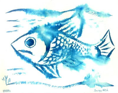
091019a Wet Fish Thought I’d try out wetting the paper after using Quink ink to paint this fish. What better medium than watercolour to convey the blurriness of an object under water! The ink pigment blooms like tiny coral branches out of the painting where the spray diffuser landed most heavily.

Here the rear end of the painting was wetted only, creating a perspective blurring of the back end of the shoal.

Okay, Hockney has been there and done this in oils, but watercolour is a natural medium for such optical experimenting, though far less predictable, of course! Quink ink on Khadi handmade paper.

Tuesday, October 13, 2009

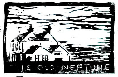
The Old Neptune, Whitstable linocut


Work in progress. First draft and test print of one of Whitstable’s better-known landmarks. The Old Neptune sits right on the pebbly beach and is a favourite place to watch a beer and the sun, go down. Regarding the linocut, I just need to use a wider/deeper cutter to incise the lettering, which has filled in with ink too easily, so I will open that up. It needs a bit more care in the consistency of inking too, but it will all look excellent with some hand-colouring in watercolour later.

Friday, October 09, 2009

2009 linocut 091009


My lovely girlfriend Fiona has been putting together a ‘mosaic family portrait’ (samples of which I must find later) which is basically as you might guess a photographic print for one family made up of umpteen small photos of an identical size to make the whole. For her first one, she needed the year’s date, so I was tasked with coming up with something in a square format. Looking for something bold, I chose a linocut. It’s been a few years since I did one at college and I think even this modest sample has renewed my interest in the medium. Inspired by a few Etsy and Flickr artists, I popped into London’s well-known art suppliers in my lunch hour, Cowling & Wilcox and the ancient Cornelissen & Son, the latter feels like one of those Harry Potter wand shops, oak panels, hundreds of drawers full of arty treasures and creaking floorboards! So, equipping myself with two rubber rollers; oil and water-based inks; lino cutters and lino pieces, I was set all set. Oh, and a new word in my lexicon, a baren, which I was unfamiliar with. It’s used for pressing the paper onto the lino from the reverse. I have a modern rubber and felt one, but Cornelissen & Sons (naturally) also sold traditional bamboo ones. Apparently, there is only one solitary craftsman in China left who still makes them. (Or perhaps it’s an urban myth). I should really have bought one to help keep him in business, but a) I was advised honestly that my modern baren was superior and b) I had already spent too much and the Chinese ones were suddenly outside my budget. When it comes to art materials, I find they are on a par with fishing tackle shops and I find it hard to ignore a nice shiny gadget!

I won’t go into the detail of how I did it until next time, when I will also do a more adventurous and illustrative linocut, but suffice to say I was completely hooked and can’t wait to get started on another next week. Watch this space!

Wednesday, October 07, 2009

Invite for our November show at The Horsebridge, Whitstable.


My lovely girlfriend Fiona (who is a photographer) and I are having our second joint exhibition at The Horsebridge Art Gallery in Whitstable. I can’t take credit for the idea for the card, which was Fiona’s ;) Watercolour on Langton Rough 300gsm paper.

Tuesday, October 06, 2009

Charcoal & Conté version of ‘A Fantasy Full of Fail’


This was more like it. The depth of tone that comes with charcoal and Conté conveys well the dark and light contrasts which adds so much to the feeling of melancholia. Just enough grittiness, though were it to be a painting, I’d probably emphasise the seediness even further!

Biro sketch for 'A Fantasy Full of Fail'


I once read a story about a vicar meeting a mermaid when I was younger and recently the idea for a drawing in a more adult vein came to mind. This was the idea I had in my head, but I wasn't happy with the fussy composition and the more or less realistic figure proportions. The Biro also could not convey the gloomy, brooding atmosphere I was after. Anyway, I left it unresolved in the sketchbook for a week and revisited it last night with the charcoal and Conté drawing, (next post, above).

Monday, October 05, 2009

Office desktop 091005


A quickie lunchtime sketch at work. Permanent pen on khadi paper with a Quink ink wash plus highlights spotted in with the correction pen shown. The yellowish tinge of the khadi paper doesn't show up too well but is far more interesting than plain old white.

Friday, October 02, 2009

Blue Koi (Khadi paper) 091002


Sold another painting so I thought I'd treat myself to a new sketch book. This one's a handmade Khadi (cotton rag) watercolour sketchbook, rough surface and 210gsm. The sized surface and pulpy paper makes for some interesting effects.

Illustration for upcoming 'Lake District Map'

Hand-drawn in brush pen with digital colour.  © Peter Gander